Google’s main index is now “mobile-first.” What does this mean exactly? And how does this impact your business?
In March 2018, Google announced that after a year and a half of careful experimentation and testing, they started the implementation of their mobile-first indexing. Because there are some wrong assumptions about this major SEO development, it is fitting to give some further explanation.
Google’s crawling, indexing, and ranking systems have typically used the desktop version of a page’s content. This caused some issues for mobile searchers when that version is vastly different from the mobile version.
What Is Mobile-First?
The new mobile-first indexing means that Google uses the mobile version of the page for indexing and ranking because so many people use Google on their mobile devices. This development also impacts the desktop search results because Google continues to have one single index for serving search results. The main index for all searches is now “mobile-first” as the Google Webmaster Central Blog explains.

Why "Mobile-First" Matters
But what’s driving this massive shift to mobile?
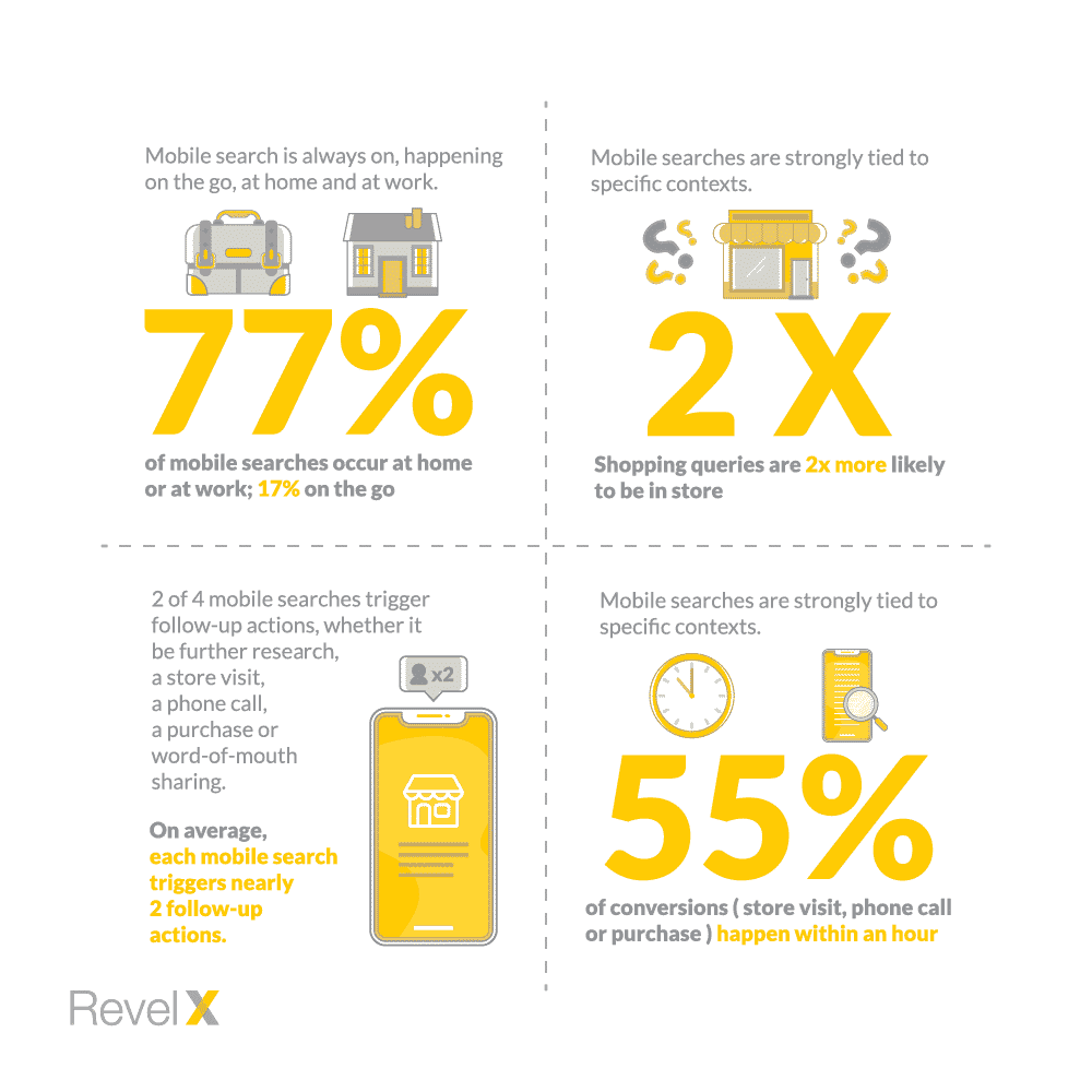
It used to be that people only used mobile searches out and about, on the go, away from home. But not anymore. 77% of mobile searches now happen at home or work. And on average each mobile search triggers nearly 2 follow up actions. Mobile searches are also strongly tied to specific contexts. More than half of the conversions (store visits, phone call or purchase) happen within an hour.
Now that Google gives mobile sites priority, it is time for businesses to reassess their mobile strategies.
I recommend that you ask yourself the following questions:
- Does My Website Have a Mobile Version?
What is the main reason why you should have a mobile website? You should because many consumers are looking for services and products through their mobile devices. Since the introduction of “mobile-first,” your mobile site is even more crucial. There are two forms of a mobile website:
- a responsive website that displays the website in a simpler way on mobile devices;
- a separate mobile version of your website that is designed to have the best user experience on mobile devices.
- Is My Mobile Website Fast Enough?
The internet has made consumers into instant-gratification junkies. Slow websites will cause visitors to abandon your site frustrated without making a transaction or requesting a quote. So, find out if your company website meets the up-to-date requirements for speed.
How do you accomplish this? Well, think about your mobile website as a light version of your desktop website. Drop everything that makes it difficult to read. This includes pop-ups, footers, etc.
- Is My Website Too Complicated?
The more steps a prospective customer has to take to make a purchase or request a quote, the bigger is the chance that she will abandon the process entirely. You should limit the number of actions that are required for a conversion.
Take a page out of the Amazon playbook. With its ‘one-click’ purchasing button, they increased conversion because it shortened the decision-making process considerably. The button made customers happy too; no more hassling with endless check-out procedures.
Related posts

5 Growth Mindset Examples That You Can Use in Your Job Tomorrow
People who believe their success is based on hard work,…

Retention strategy: Keeping the right customers
Retaining customers is a top-line priority for any…

Who are my most valuable customers?
Legend has it Alfredo Pareto noticed something unusual in…